BRAND & PROJECT ESSENCE
Rory is a holistic wellness brand that supports sleep by developing personalised self-care routines rooted in aromatherapeutic products and mindfulness.
The goal of the project was to develop brand essence based on research, a visual identity and promotional campaigns that highlight Rory’s approach to joyful self-care and help the brand connect with a global customer base.
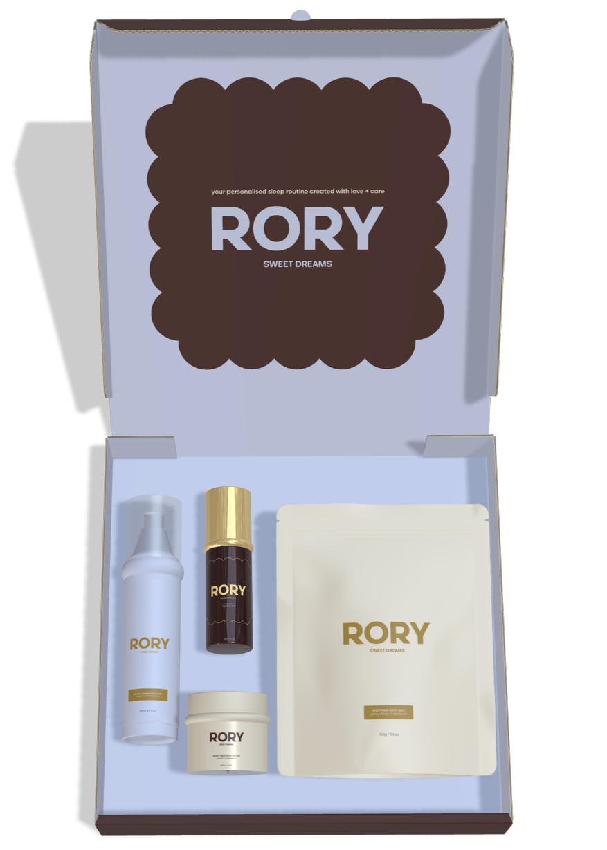
BRAND NAME: as a nickname for Aurora – the Sleeping Beauty – Rory is a perfect name for a brand that creates self-care products for sleep. It sounds soft, adds a humane touch to the brand and looks cool in a logo!
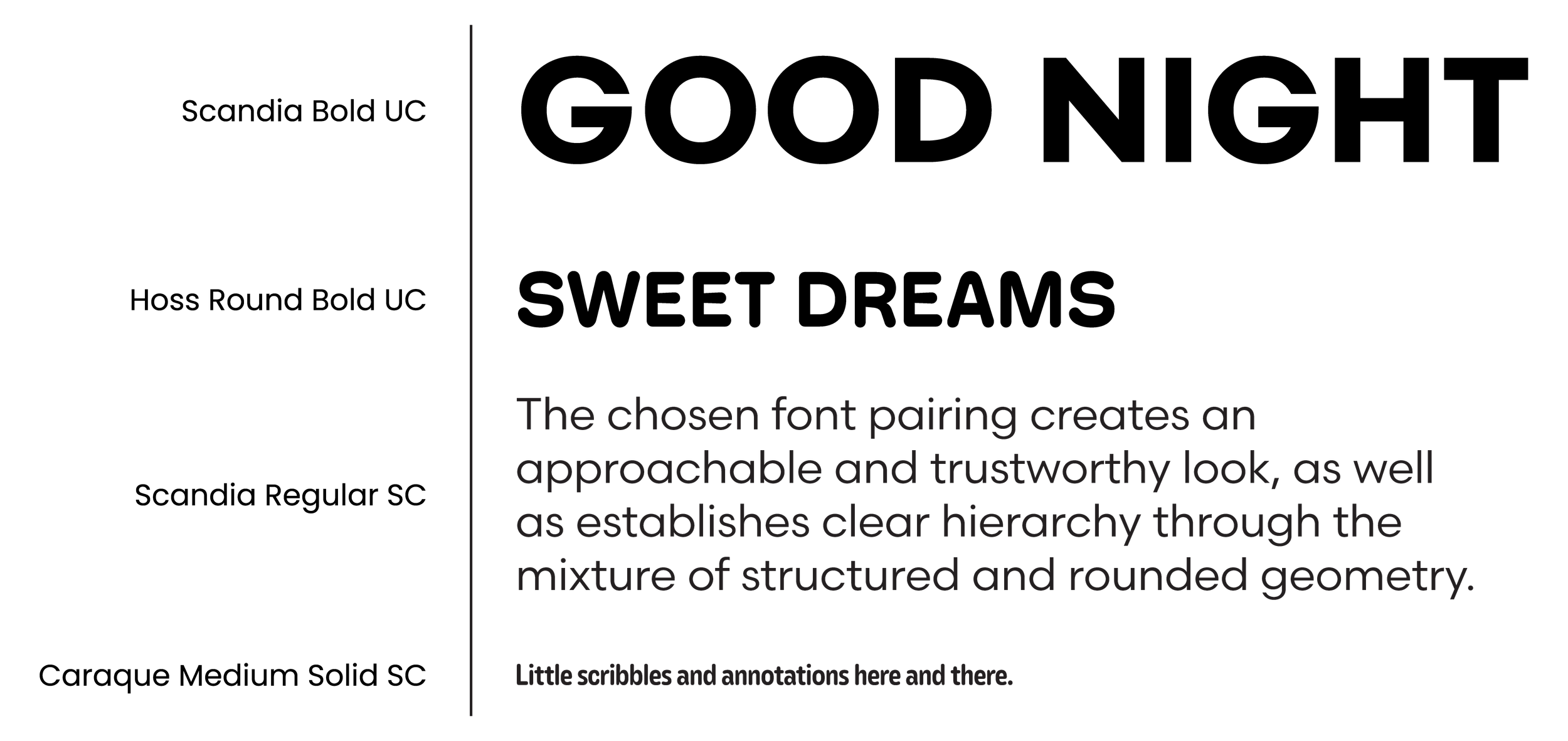
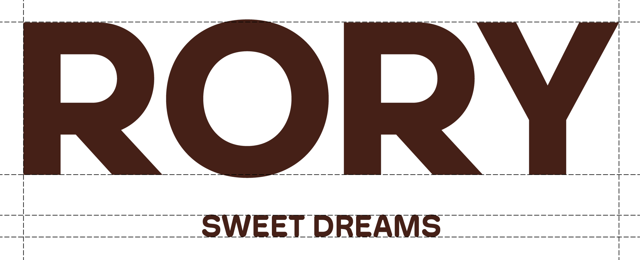
LOGO DESIGN: based on Scandia – a sans serif font with open counters, generous spacing, and clear letterforms – the logotype aims to reflect both Rory’s modern approach to sleep-care rooted in simplicity and the brand’s easy-going, comforting identity.
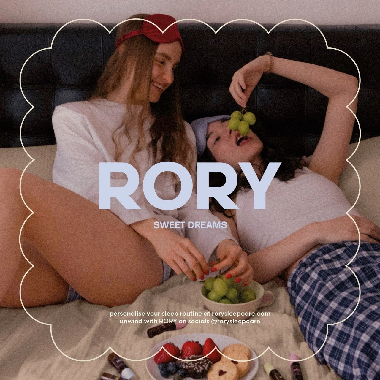
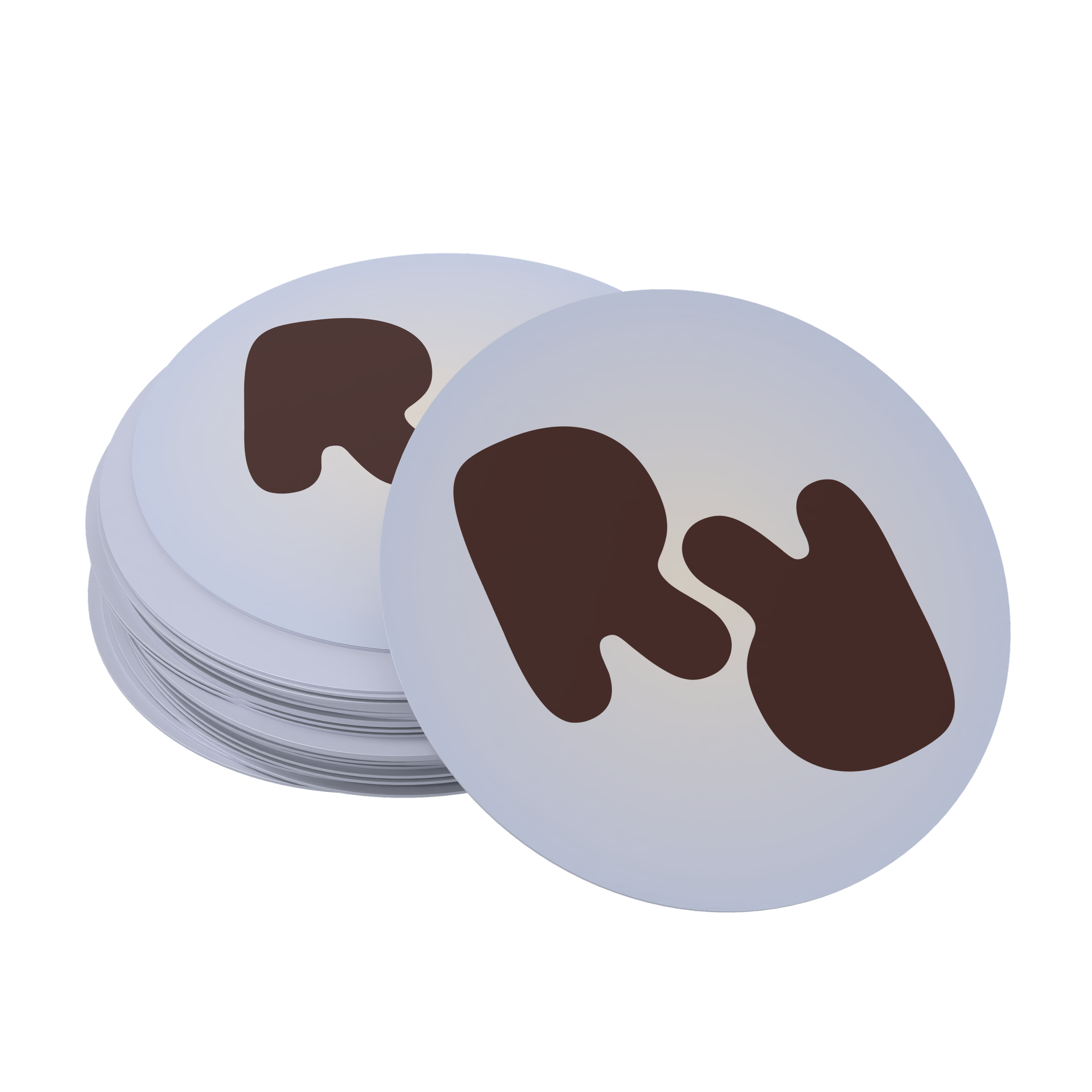
BRAND MARK: inspired by the repeating R’s in Rory, the cloud-like shapes resemble of puzzle pieces striving for unity. This visual metaphor reflects the brand’s holistic approach to wellness, where small consistent routines come together to produce meaningful results.
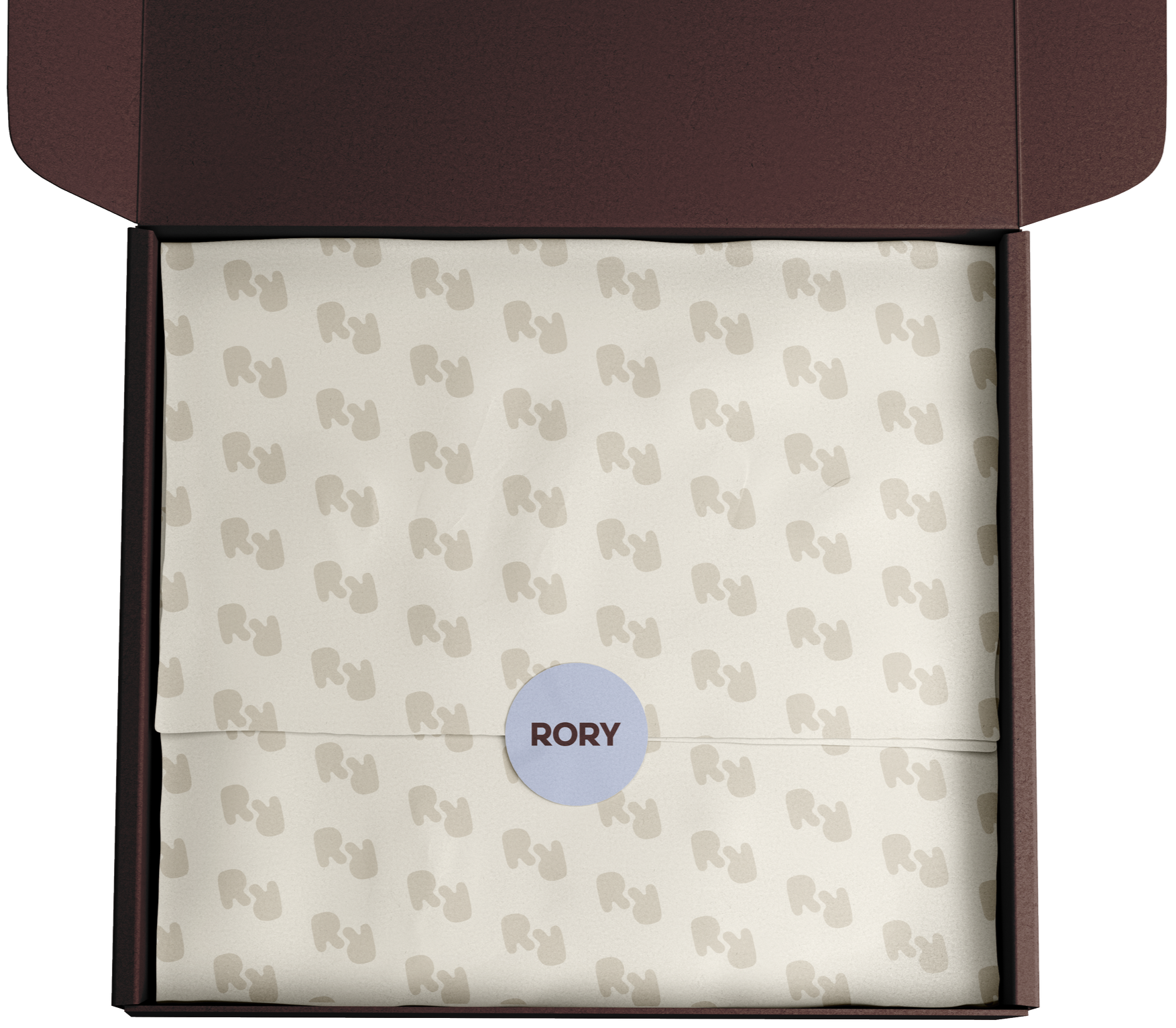
PATTERN: the mark transforms in a pattern resembling of the ascending sleep symbol – Zzz.
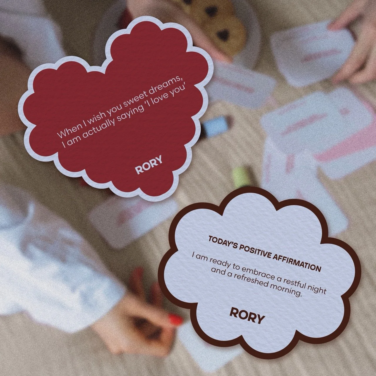
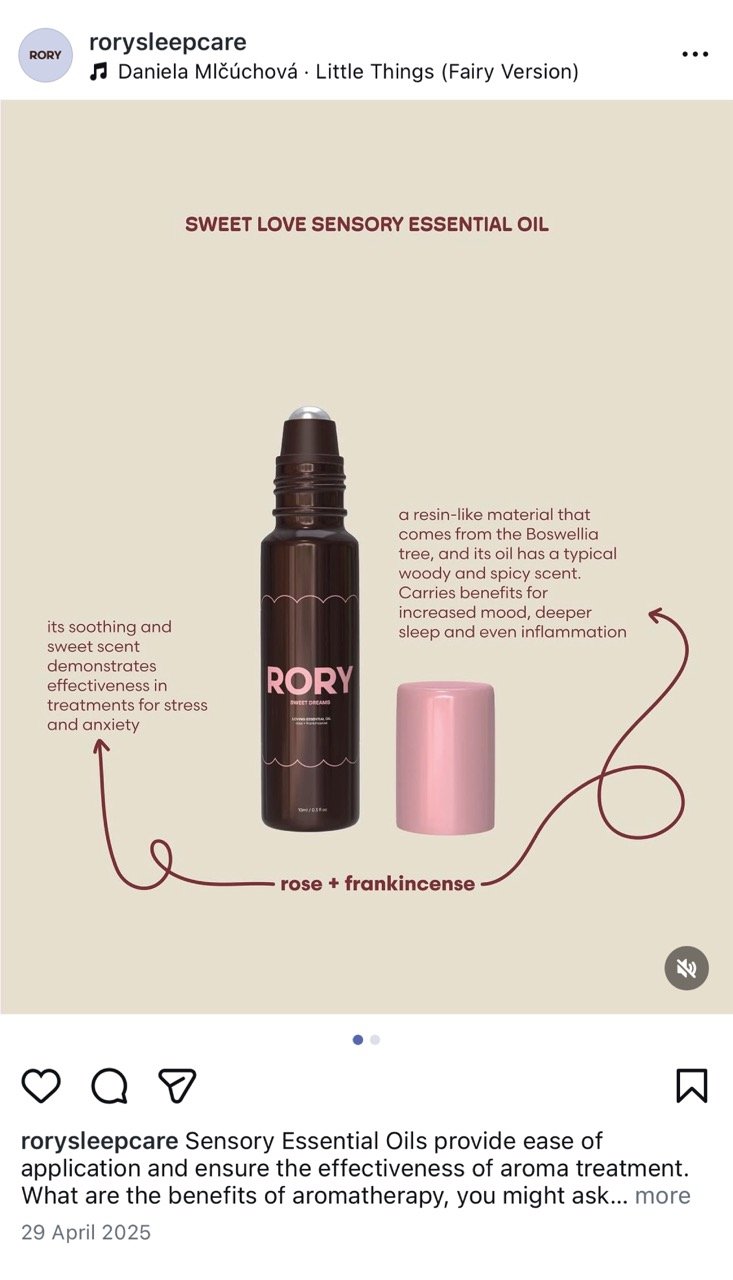
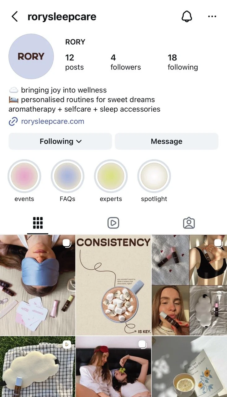
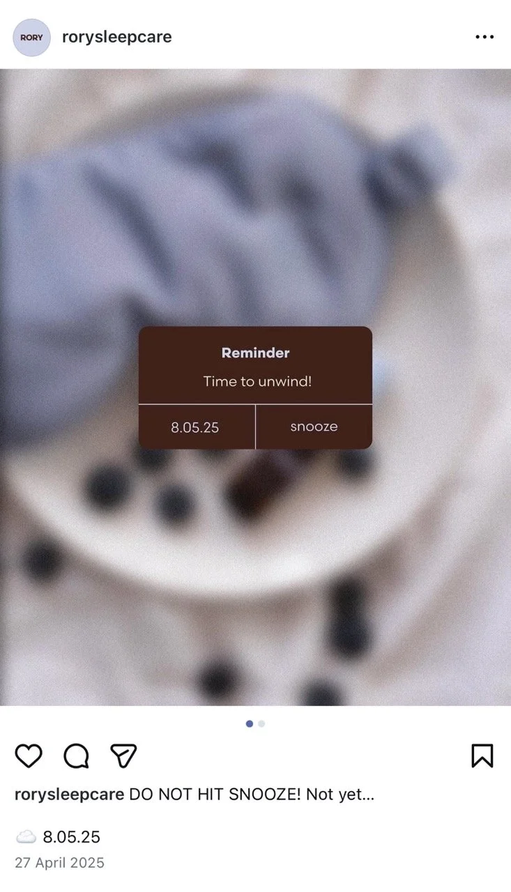
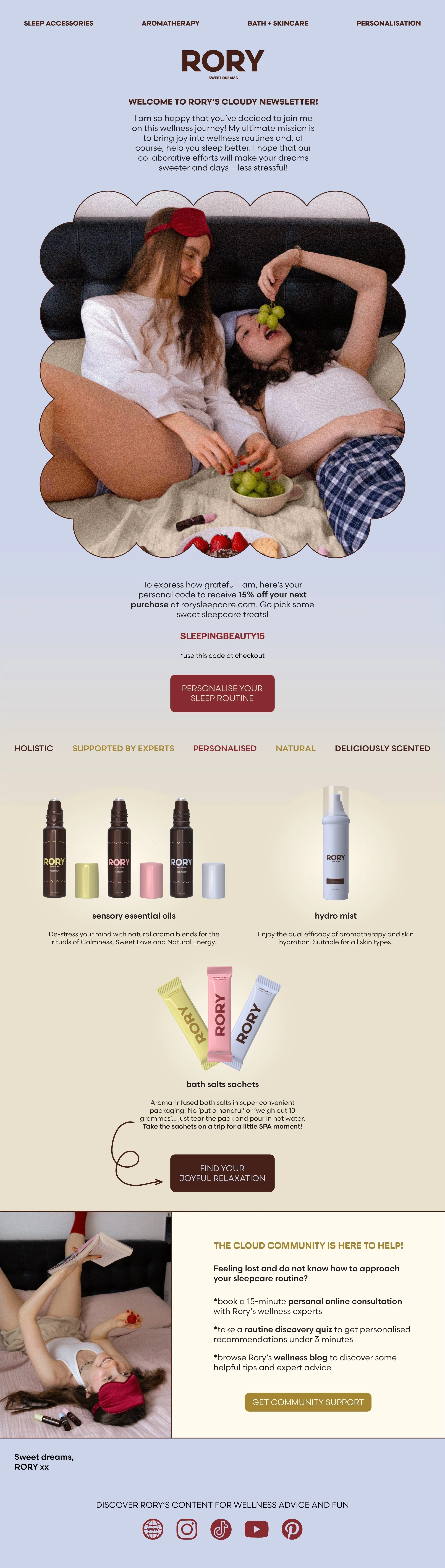
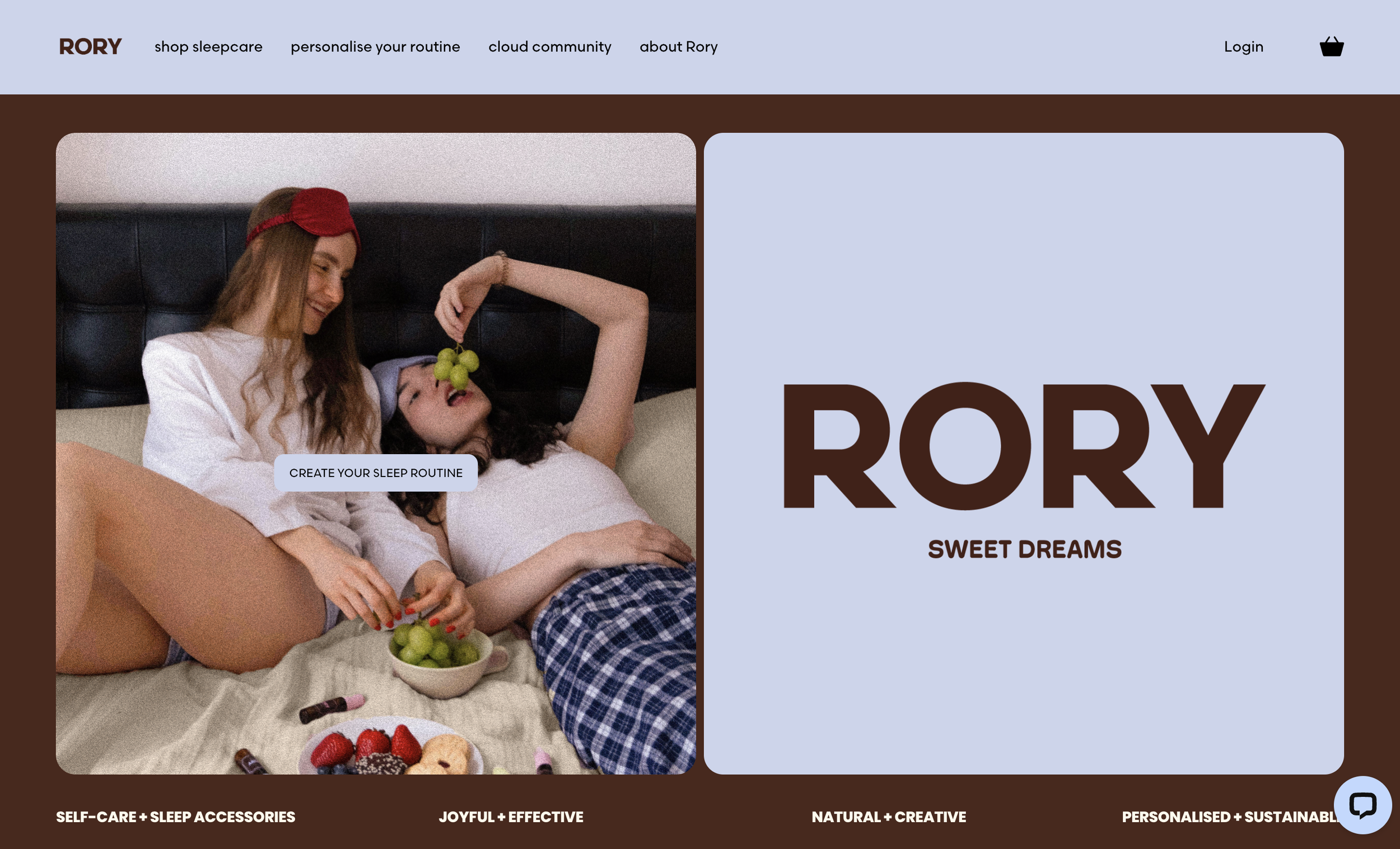
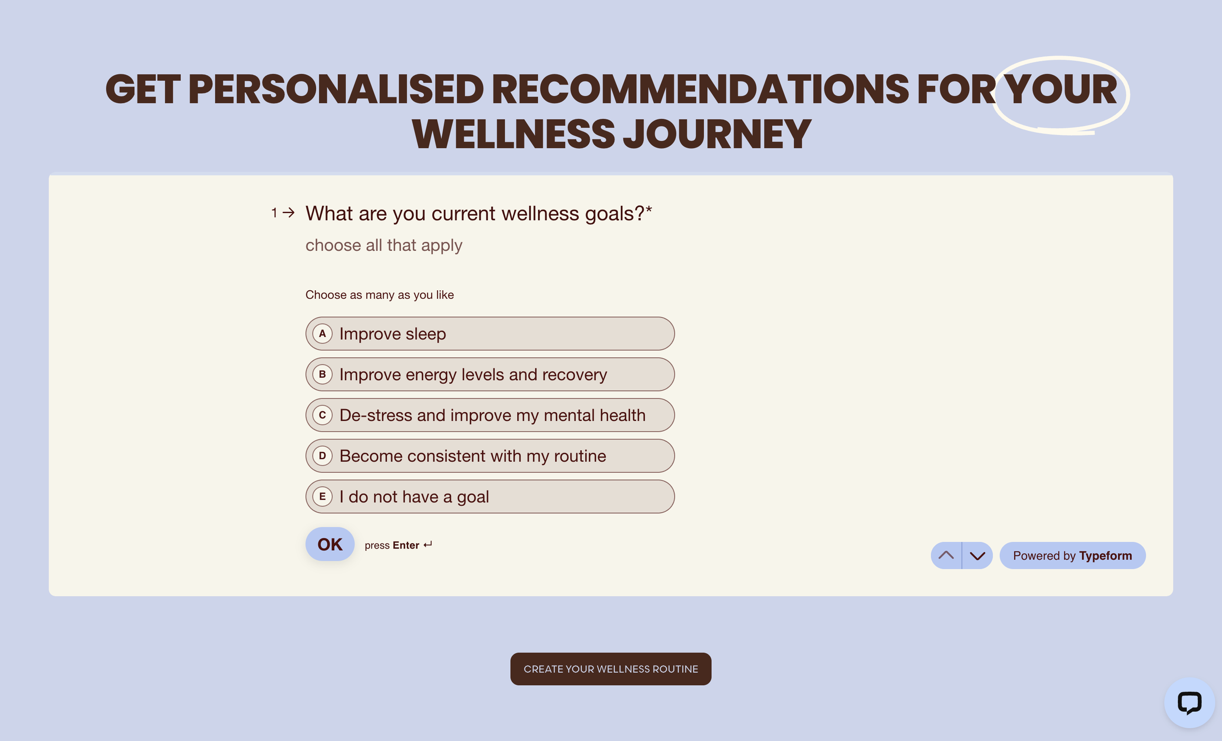
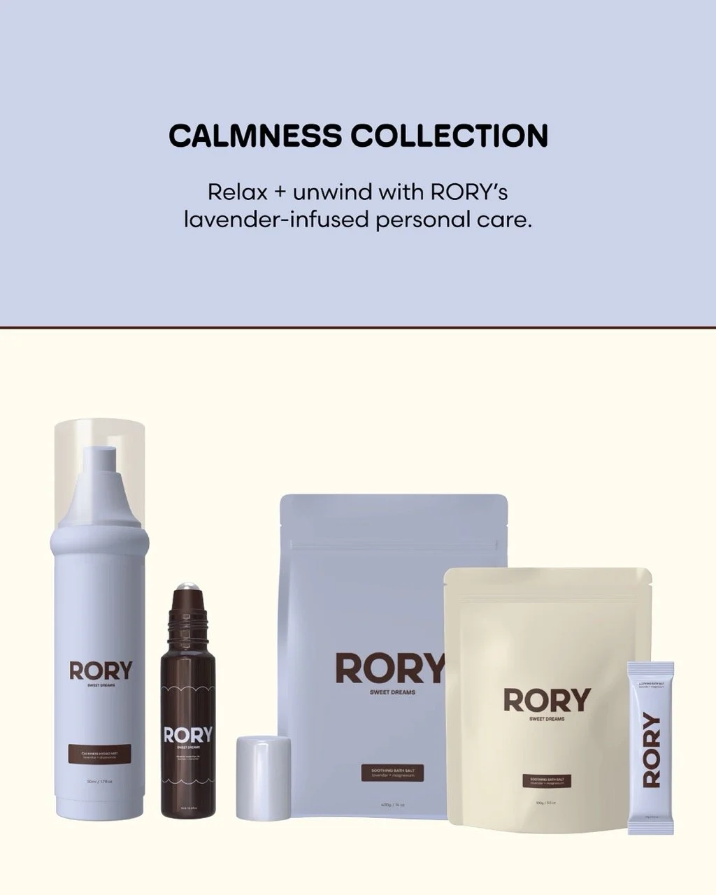
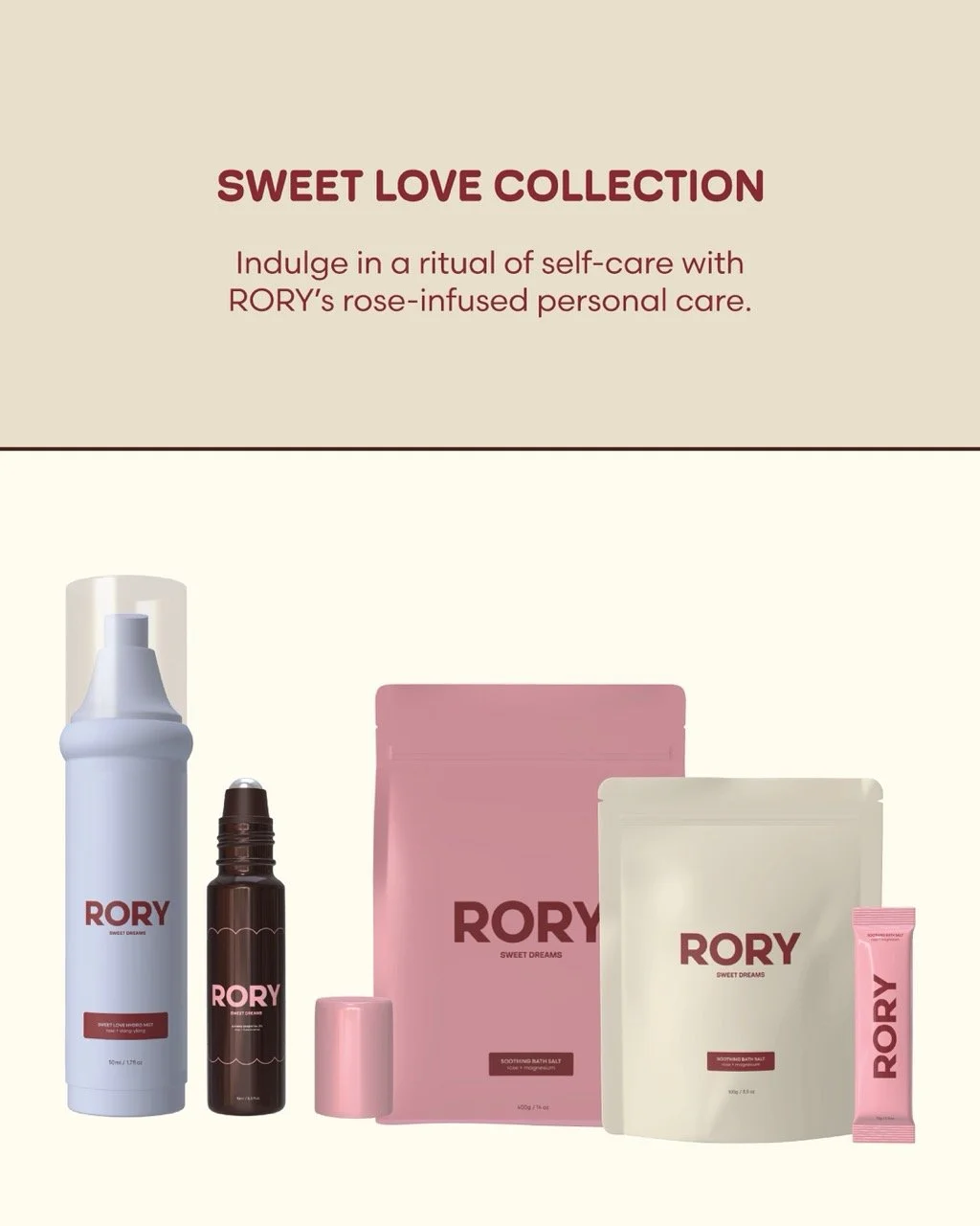
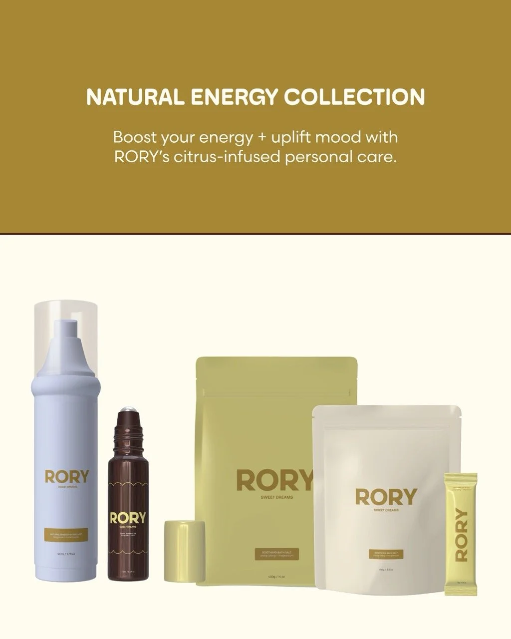
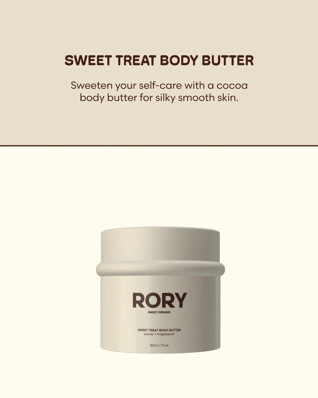
APPLICATION: the visual assets are consistently integrated across Rory’s digital and physical channels such as the newsletter, social media, online website and stickers.
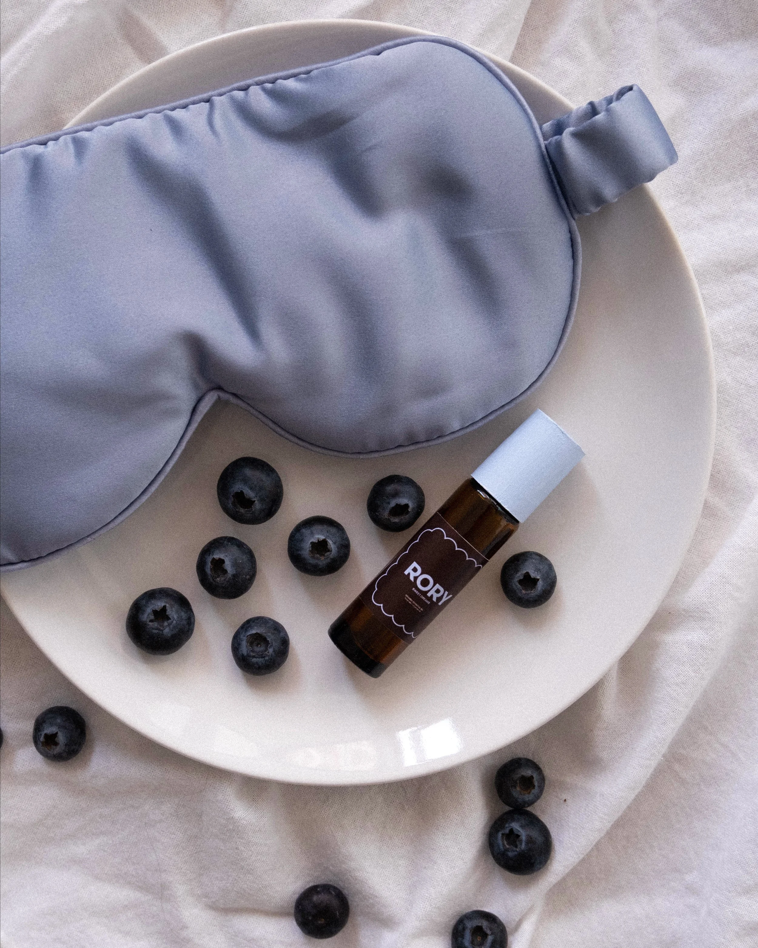
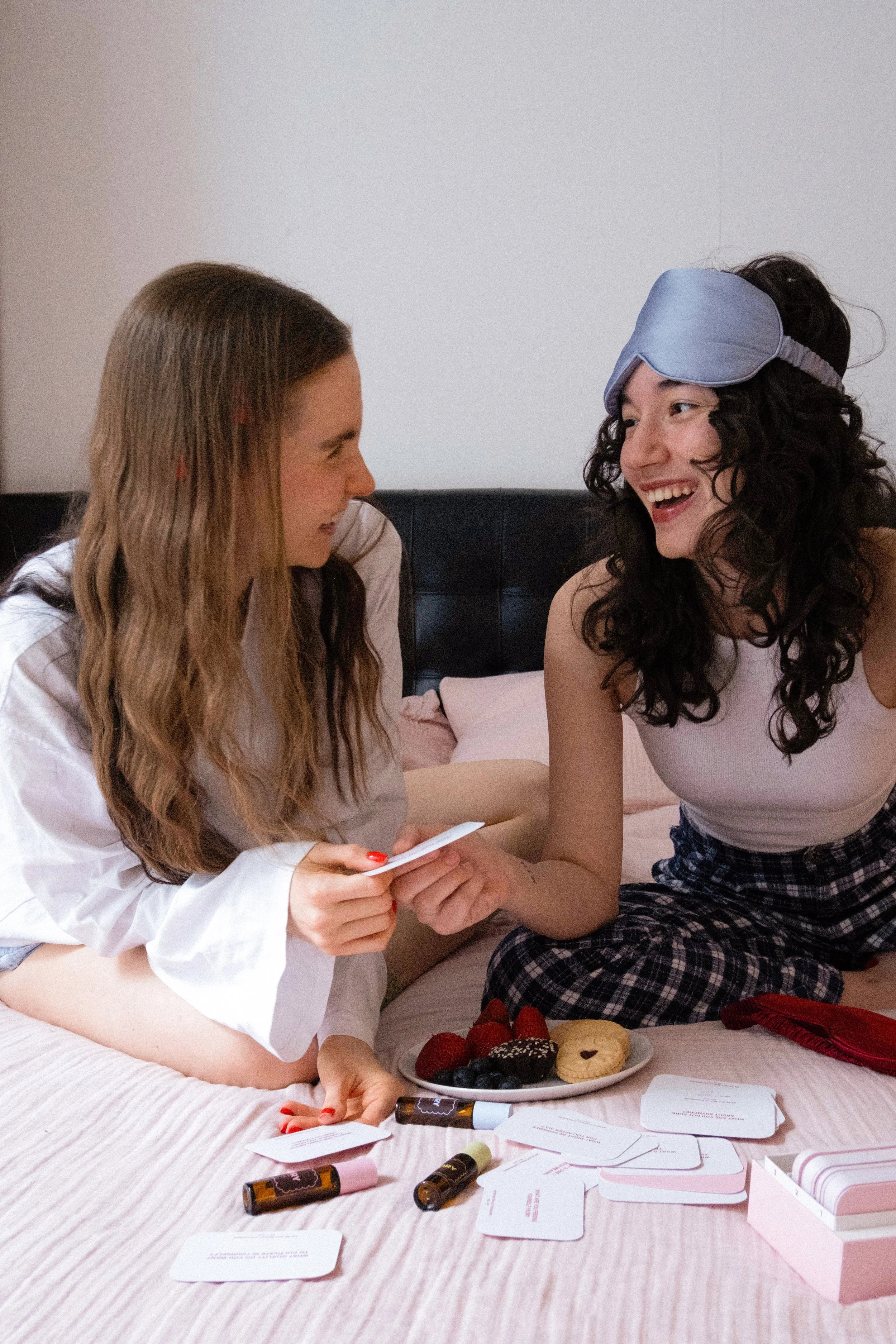
PHOTOGRAPHY: featuring authentic emotions and relaxed ambience, the imagery style celebrates Rory’s community-focused vision and playful identity.