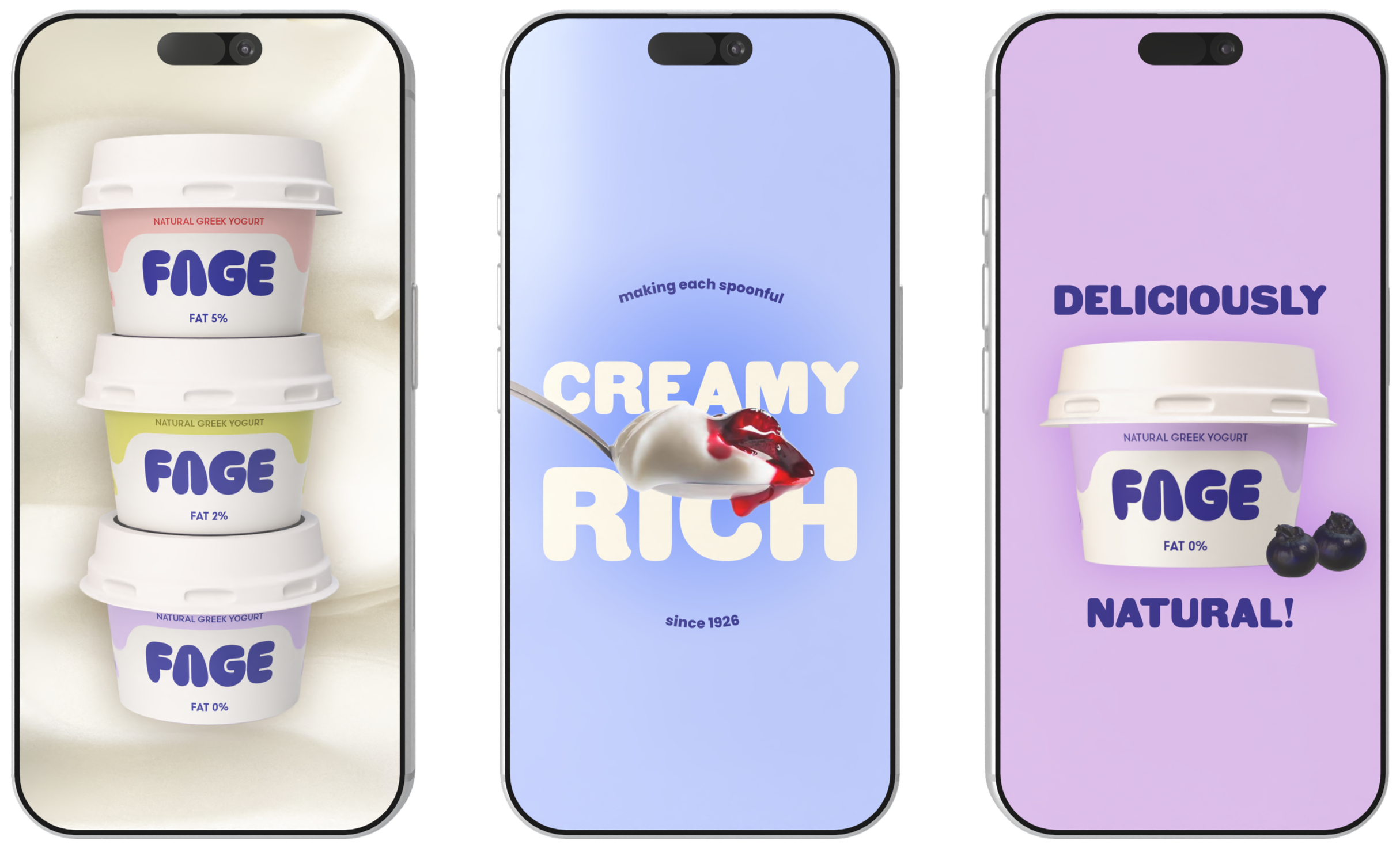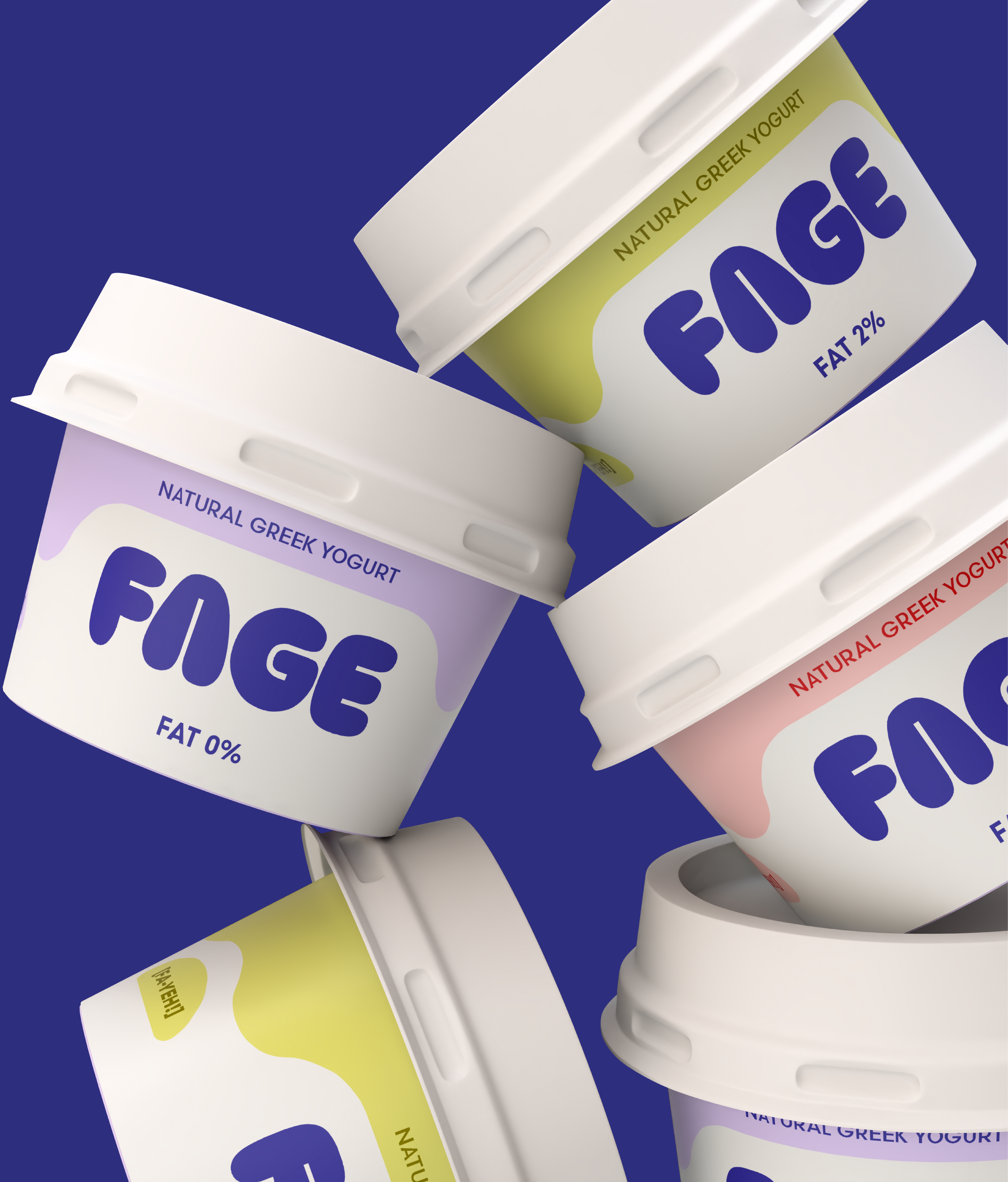
FAGE is an international dairy company founded in Greece, which has been loyal to its original packaging since 1970s.
As a designer and a big fan of FAGE’s greek yogurts, I wanted to explore how a refreshed identity could improve the brand recognition among younger audiences while preserving its heritage and loyalty of existing customers.
*This project was created for educational and portfolio purposes and is not affiliated with or commissioned by the brand.
FAGE REBRAND
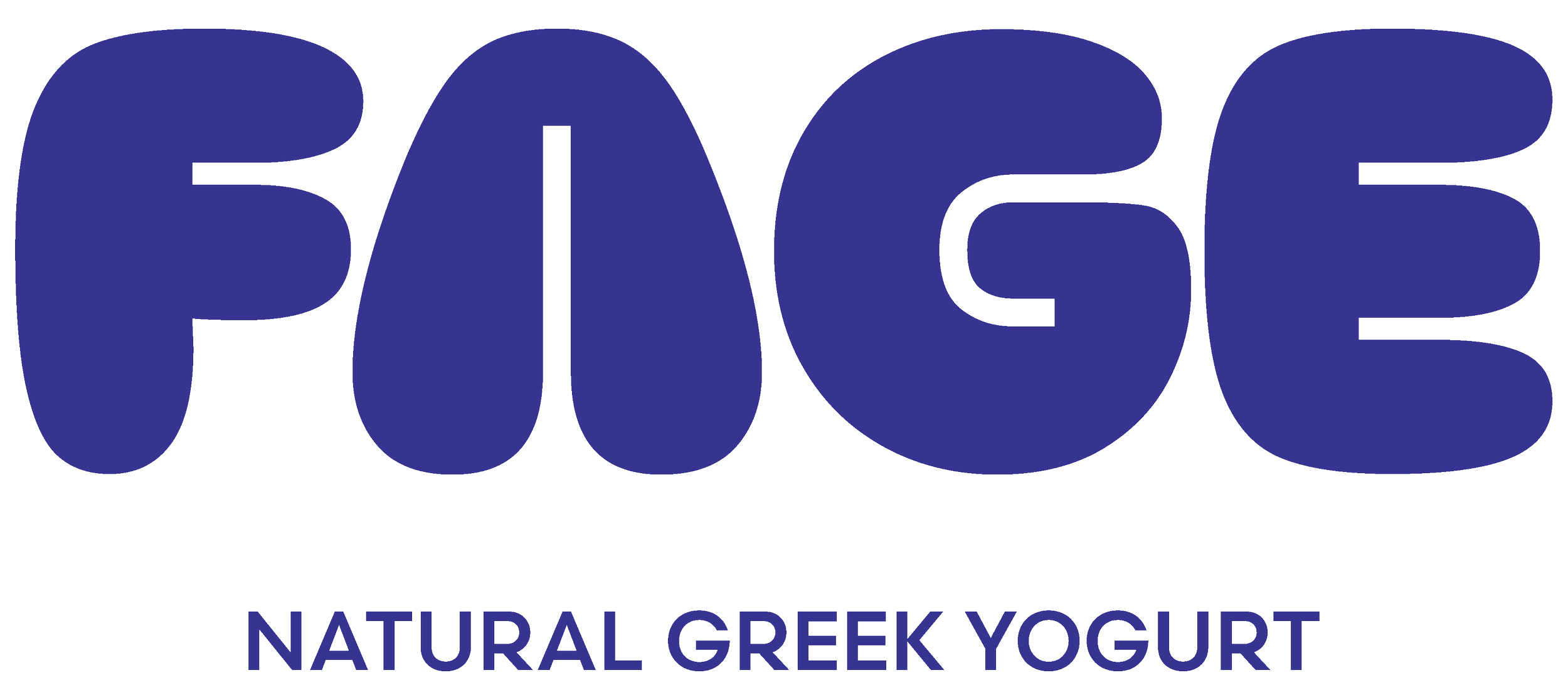
LOGO DESIGN: The reimagined logo takes its curves from the silhouettes of greek island architecture with its small arched windows and rounded roofs, as well as the traditional greek ceramics used for serving yogurt in tavernas.
The soft shape additionally reflects the creamy and rich texture of FAGE’s yogurts which is an essential unique selling point within the brand’s strategy.
COLOUR: mediterranean blue – a traditionally greek colour – is present in the brand’s original identity in combination with red. Blue is brought to the forefront in this contemporary version, emphasising the brand’s roots.
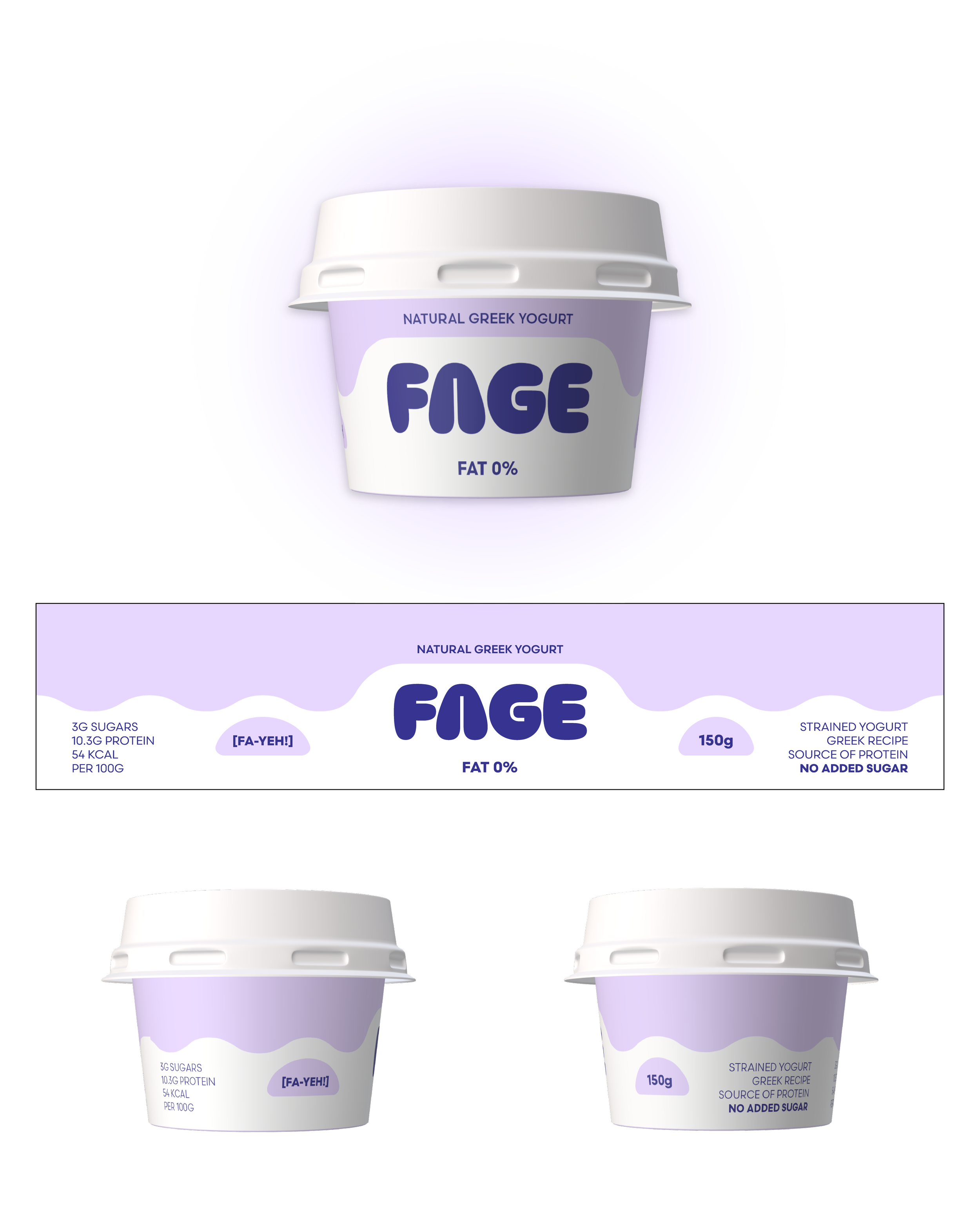
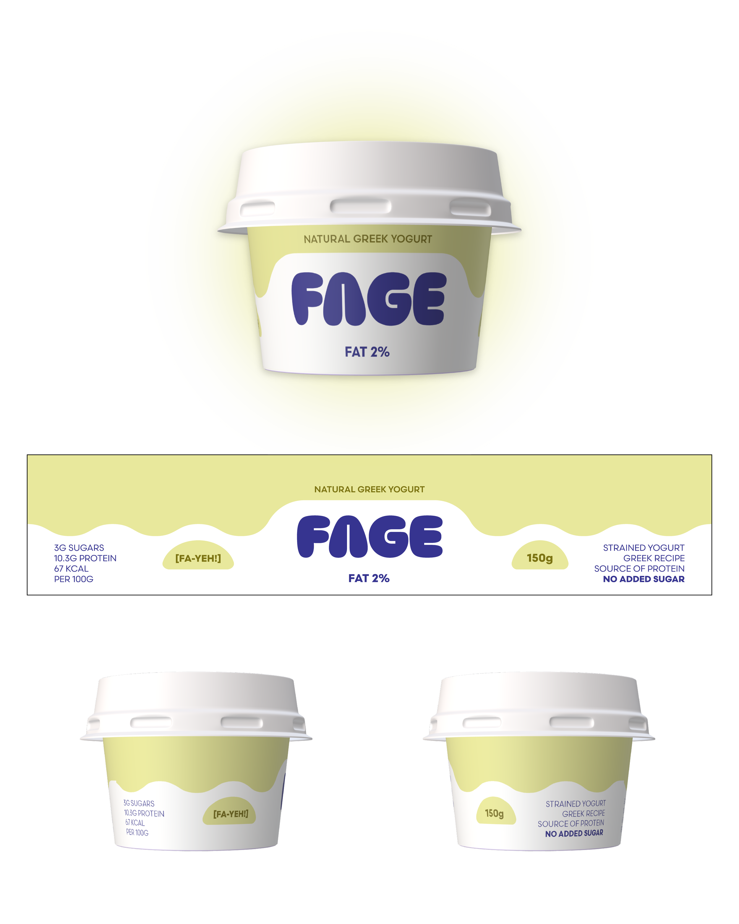
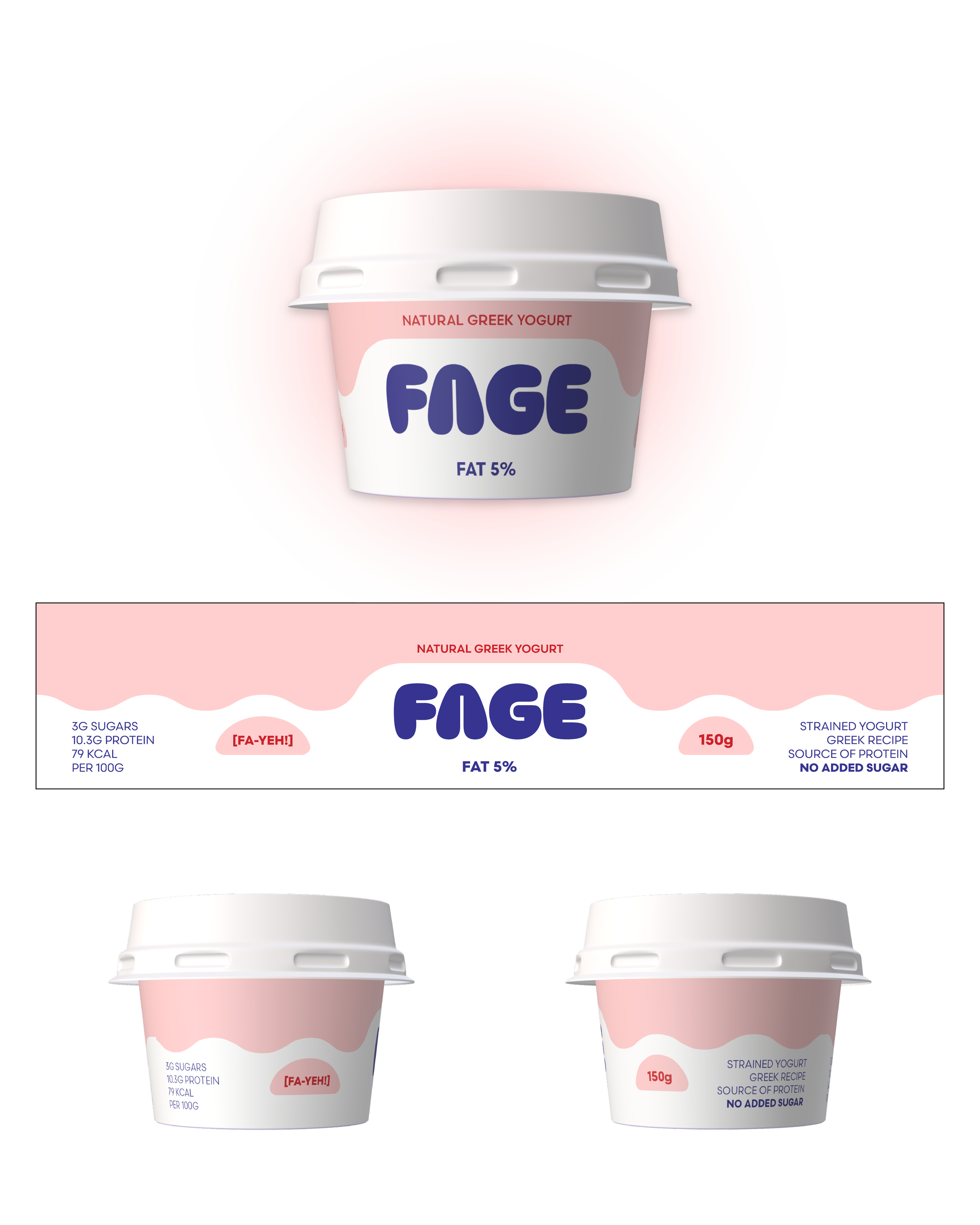
While integrating the reimagined visuals into Fage’s Strained Plain Yogurt packaging, I used the original colours and layouts to maintain visual recognition for existing customers. More defined shapes came into the place of gradients, introducing clearer composition for nutritional value sections. The curved lines, aligning with the logo’s curvy style, allow to preserve the original soft look of Fage’s pots.