INSIDE OUT POSTER SERIES
The poster series is dedicated to the characters from an the movie ‘Inside Out’ by Pixar Animation Studios. Each poster features an emotion graphically showcased through its main visual and behavioural traits with a short and funny caption or a quote.
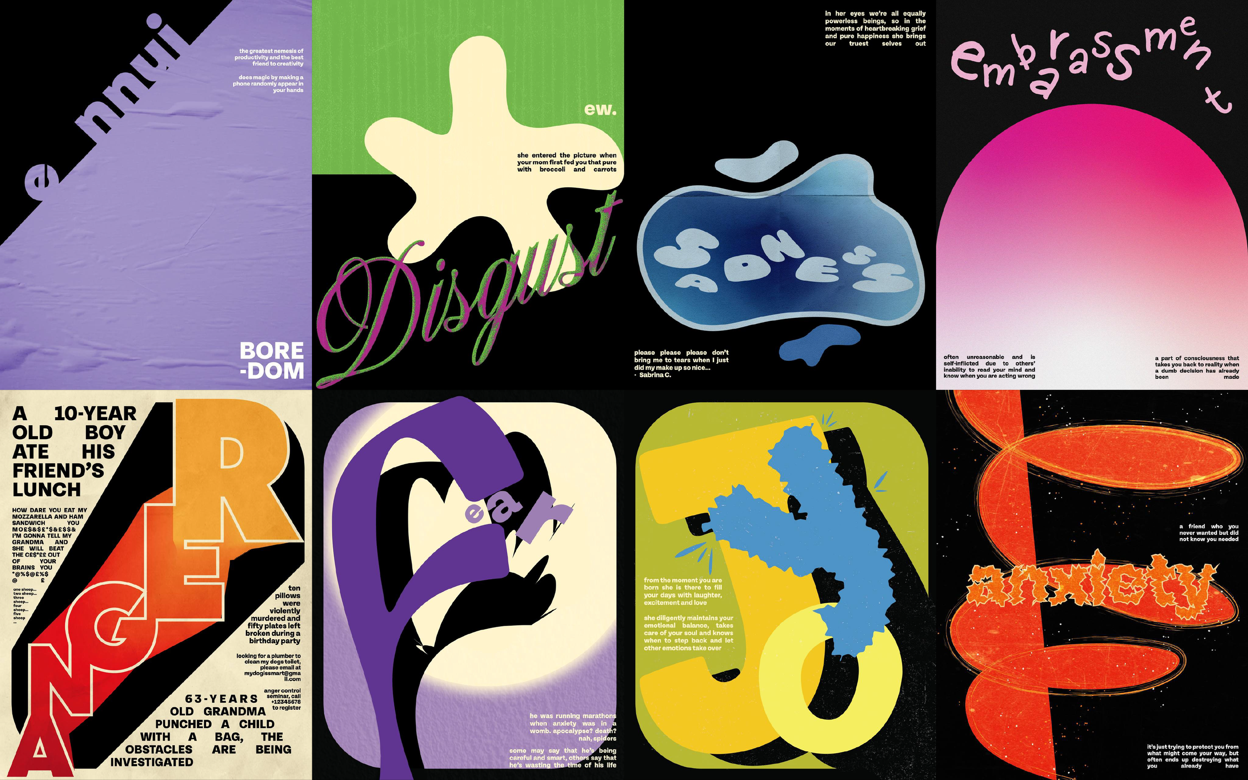
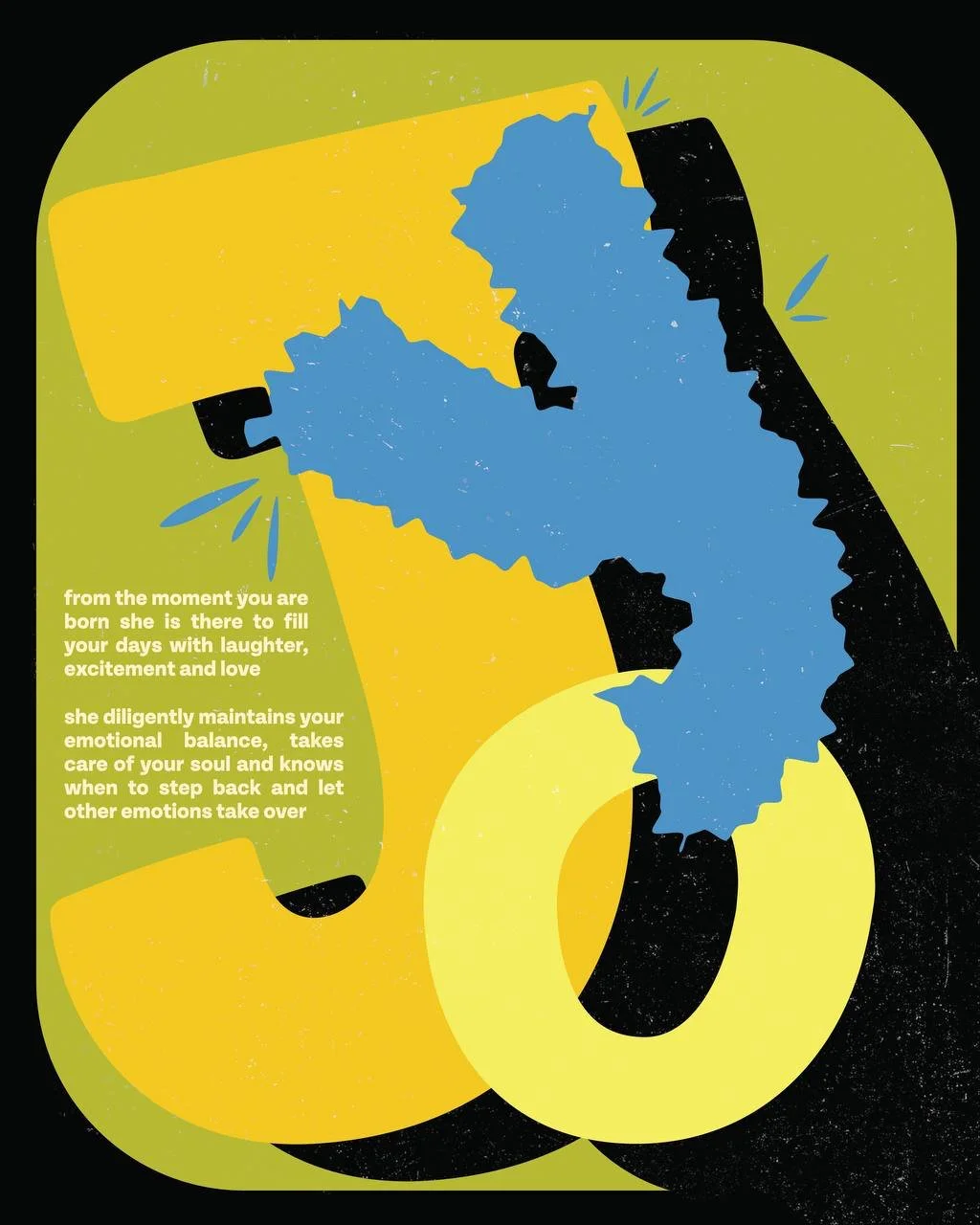
JOY
has a warm and soft personality. Her optimistic mindset reminds of the way children see the world. For these reasons, the poster features Joy’s name in large, rounded and playful letters, resembling of the ones found on the ABC book for kids.
The letter ‘Y’ was stylised to reflect Joy’s hairstyle, while the blue flower petals add playful dynamism and can also be found on the character’s dress.

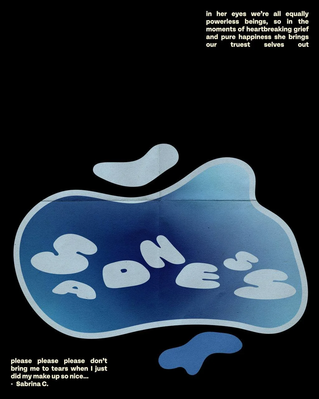
SADNESS
is often seen crying in the movie, so the poster symbolically represents her through a puddle of tears.
An inflated type mirrors the character’s rounded silhouette and soft personality. The letters are scattered around the puddle shape, reflecting Sadness’s unpredictable shifts in mood. The gradient fill allows to showcase the plethora of blue shades used in the character’s overall monochromatic visual identity.

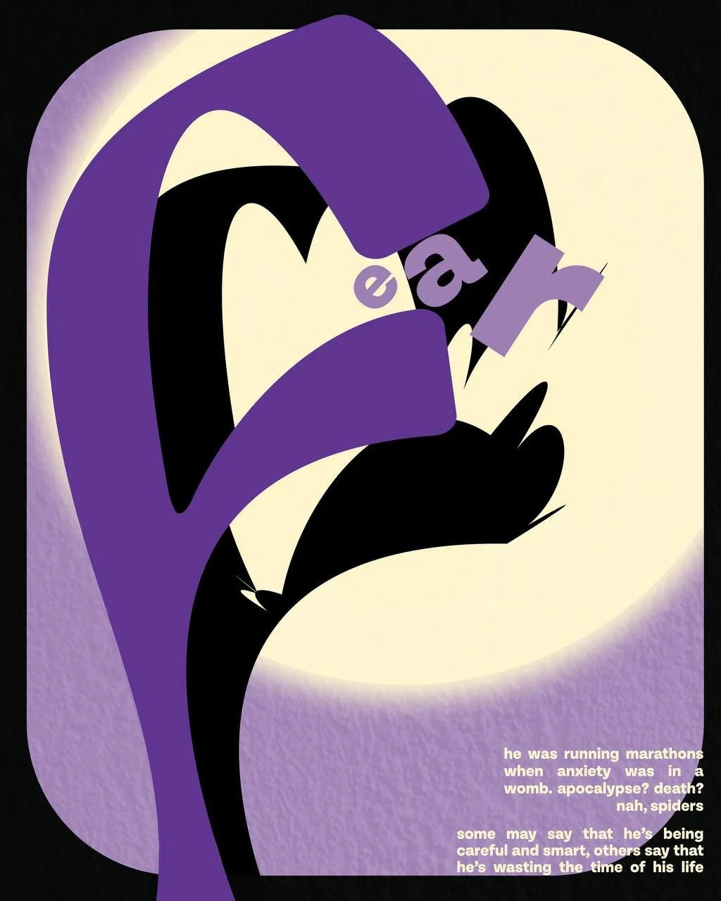
FEAR
is scared of things that often do not even impose any actual threat, such as his own shadow. Hence, inspiration for the poster was taken from the shadow theatre.
The main letter ‘F’ resembles of the character’s slouched pose, while the spotlight, which is also a common phobia (being in a spotlight), casts a distorted black shadow on the wall.
The letter ‘e’ is being ‘eaten’ by the large monstrous letter ‘f’. The ‘a’ is placed tightly in the gap, conveying the fear of enclosed spaces - claustrophobia, while ‘r’ is positioned ‘falling’, reflecting the fear of heights.
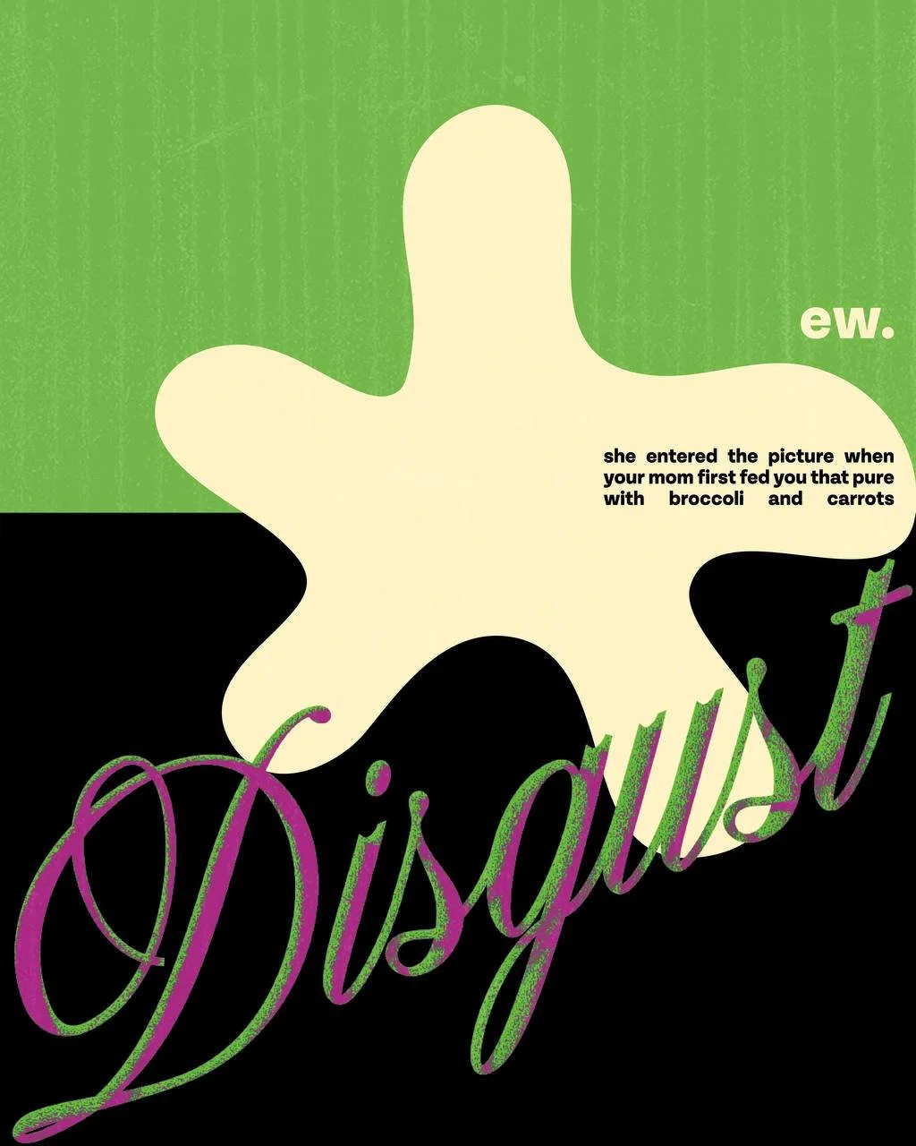
DISGUST
is a character with an aesthetic sense of style, which is reflected via the chosen script typeface. The colour diffusion effect captures the shimmery texture that can be found on her scarf, hair, chics and lips.
The huge ‘spot’ shape not only resembles of the flowers on Disgust’s dress but also reflects her tendency to be overly dramatic.

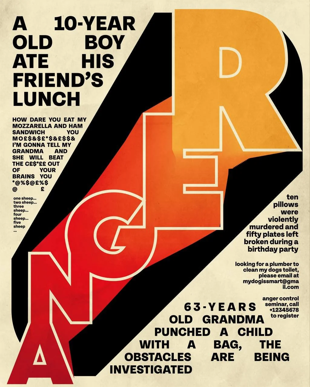
ANGER
has an explosive personality, so this poster is more visually saturated. The character is often spotted reading a newspaper with scandalous news, which became an inspiration for the layout.
The large ‘screaming’ letters have a gradient fill, resembling of the literal fire that appears on top of Anger’s head when he has an outburst.

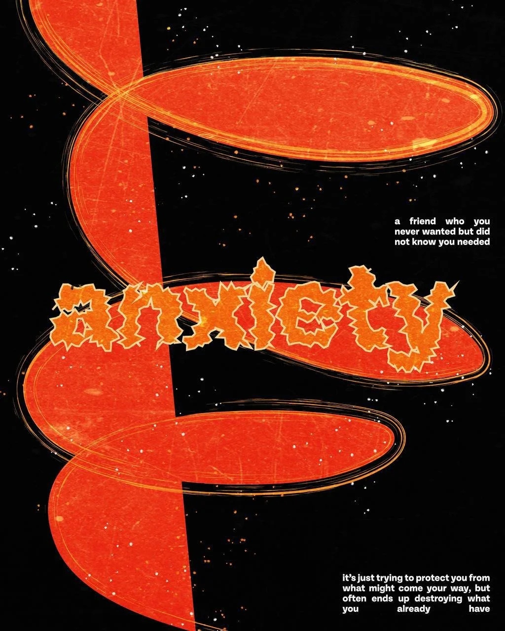
ANXIETY
appears as a highly agitated character, which is mirrored in the distorted typography.
The spiral shape is a metaphor for a panic attack which sends the main character into a mental ‘tornado’ that only keeps accelerating and does not seem to have an end.
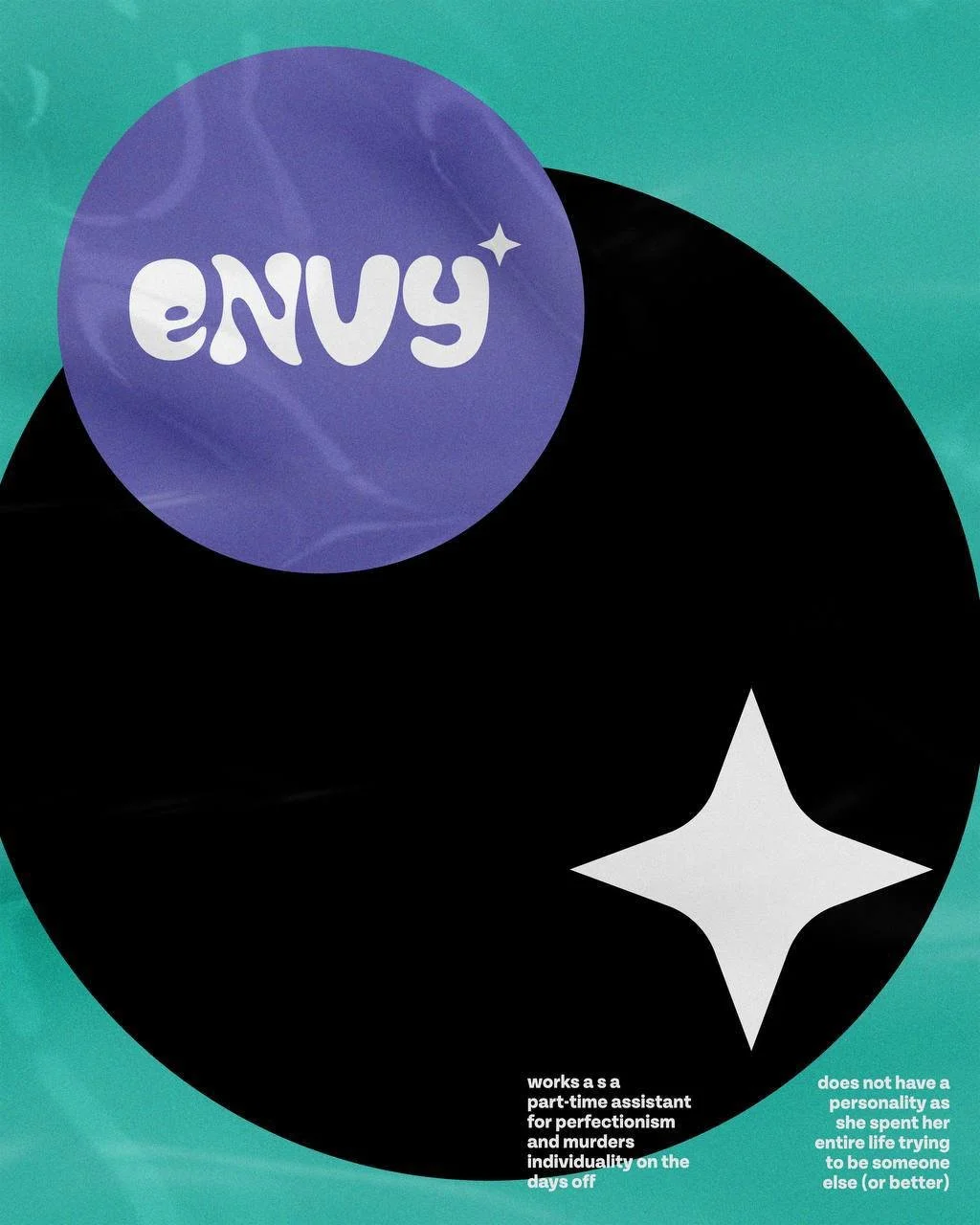
ENVY
acts like a naughty child in a toy store with her big ‘searching’ eyes that became the focal point of the design.
Envy’s name is showcased through uneven type that illustrates her slimy demeanour. It is positioned in a small circle that is trying to escape from the darker and larger one, showcasing Envy’s tendency to always look outwards and never – inwards.
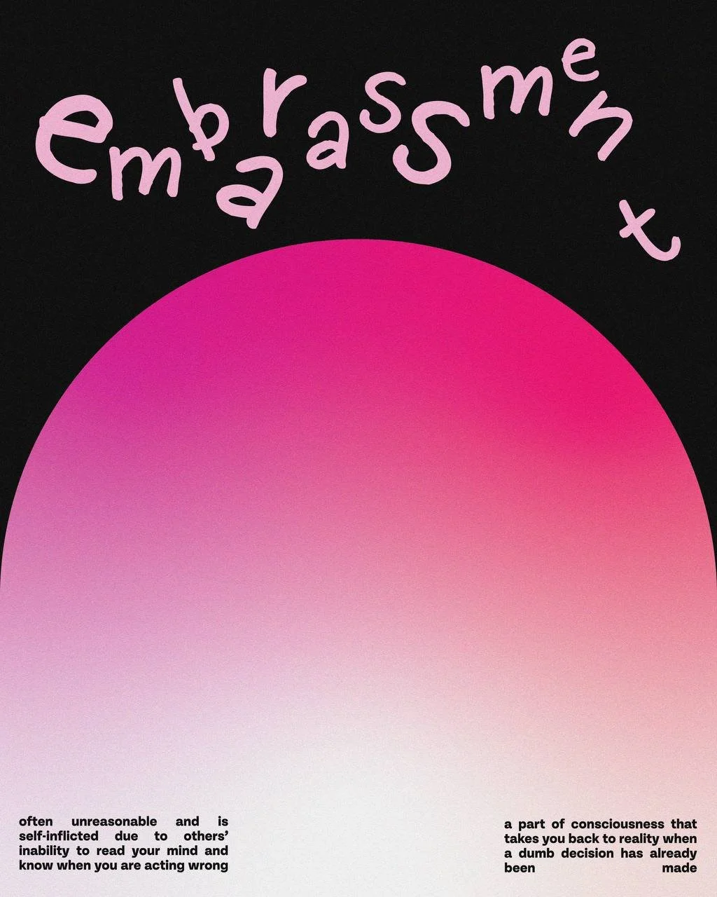
EMBARASSMENT
has a large nose which goes darker shade of pink when he gets shy. This is mirrored in the poster’s gradient fill and the large arc shape.
The letters in a handwritten font are awkwardly positioned and scaled to mirror the messy consequences of the character’s actions.

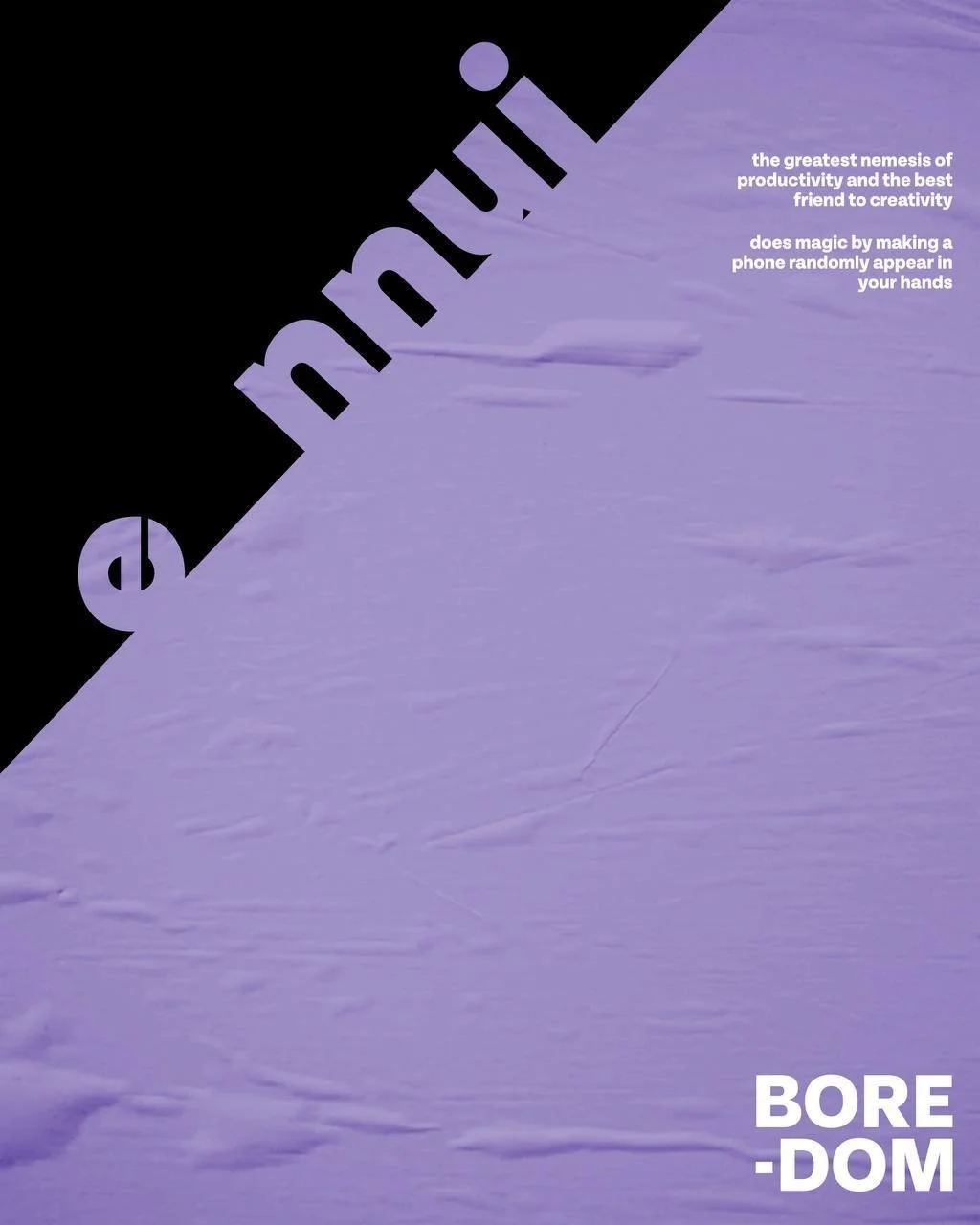
ENNUI
or the so-called ‘boredom’ is lazy and always tries to limit any movement. Hence, this character’s poster is the most minimal in comparison to the other.
The simple sans serif letters are sliding down, resembling of Ennui’s slouched posture and leisurely gait.